
Academic project · 2024
Travy
A warm travel companion to plan trips, save places, and keep a journal.
Role
Co-designed & built (2-person team)
Team
Thomas Ninh · Billy Ross
Year
2024
Platform
iOS · SwiftUI
Type
Academic project
Design basis
Nielsen heuristics · Apple HIG
The idea
A travel app that remembers the trip, not just the route.
Travy started as a class project with one belief: travelling is more than moving from one place to another — it's about experiences, connections, and memories. We set out to build a personal travel companion: part diary, part navigator, part memory keeper.
The brief was open, so we set our own constraint — a design one. Make something that feels calm and effortless, not another cluttered itinerary tool.
The motivation
Most travel apps optimize logistics. We optimized for feeling.
Booking and itinerary apps are dense with information you rarely need the moment you open them. We wanted the opposite: open Travy and immediately see your trips, your saved places, your progress — warm, visual, and personal.
It's not just an app — it's your travel diary, your navigator, and your memory keeper, in one.
The approach
We designed against principles, not just taste.
Because it was a design course, we grounded every decision in something we could defend: Nielsen's usability heuristics and Apple's Human Interface Guidelines. Instead of arguing about what looked nice, we asked whether each screen was minimal, recognizable, clear, and native to iOS.
That lens shaped everything below — from the warm visual system to how the five tabs are organized.
Visual system
Warm, editorial, and calm by design.
The whole point was to make planning feel like keeping a travel journal, not filling out a form. So the system leans warm and editorial — cream surfaces, soft rounded cards, a single clay accent, and serif headlines that give it a magazine feel.
Warm Clay
#B5703A
Brand · CTAs · active tab
Cream
#F7F3EC
App background
Card White
#FFFFFF
Cards · surfaces
Soft Gold
#E2B04A
Ratings · accents
Ink
#1C1B1A
Headings · body
Slate
#8A8A8A
Secondary text
Typography
- Headlines
Editorial serif
Trip & section titles — a warm, magazine feel
- Body & UI
iOS system sans
Labels, lists, navigation — clean and native
Cream surfaces, layered cards with soft depth, and one clay accent — restrained on purpose, so the photos and your trips carry the color.
Inside the app
Five tabs, one calm travel companion.
Travy is organized as five tabs — Profile, Map, Journal, Destination, and Progress — each doing one thing clearly.
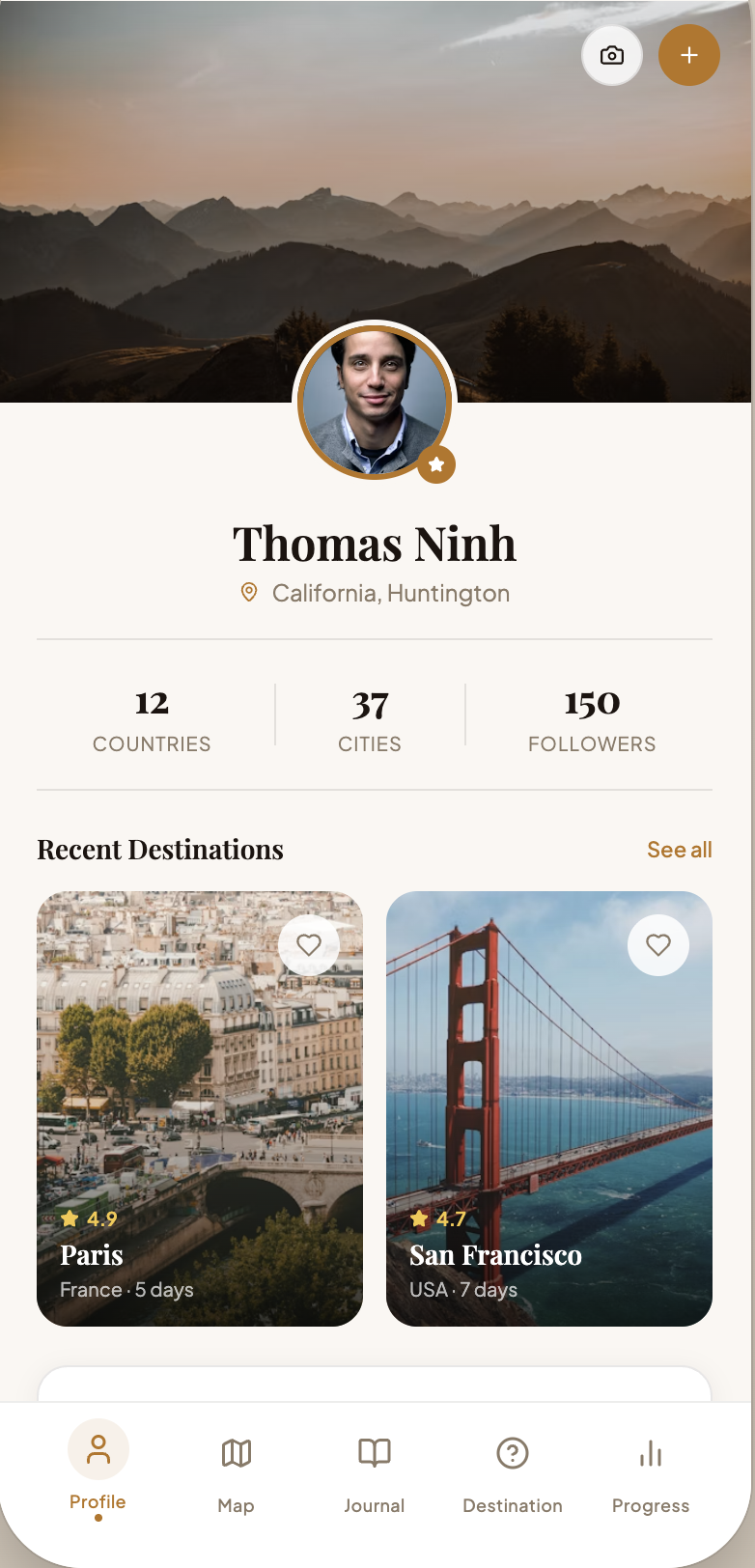
Profile — your travel identity
A warm header, recent destinations as photo cards, and travel-progress rings for countries, cities, and trip details. You see who you are as a traveller at a glance — recognition over recall.
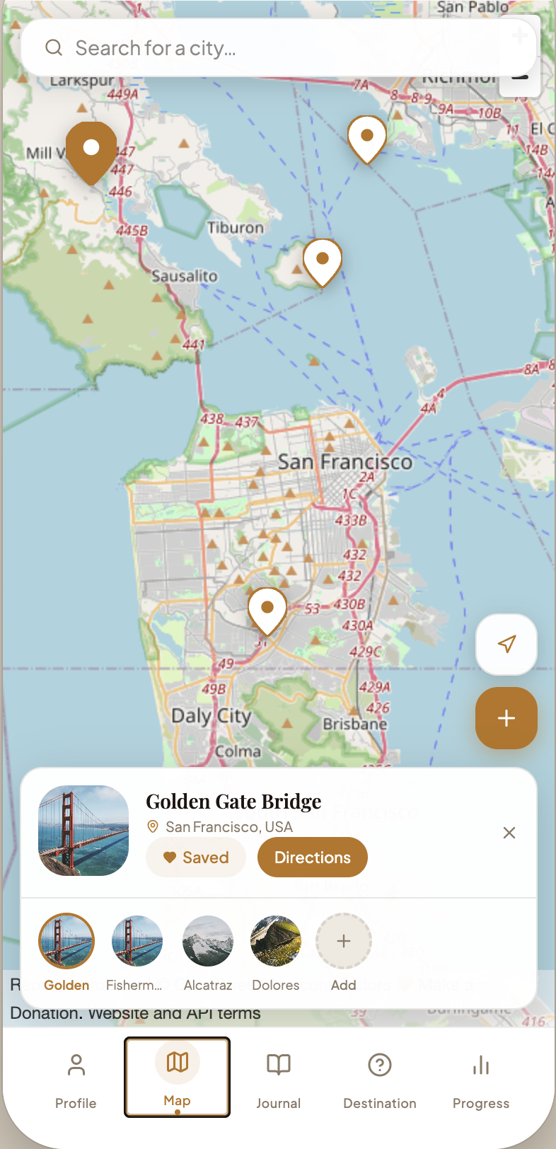
Map — plan by place
Search any city, drop and save pins for places you want to go, and tap a pin for details and directions. Saving a place is one tap, and your future trips all live in one spot.
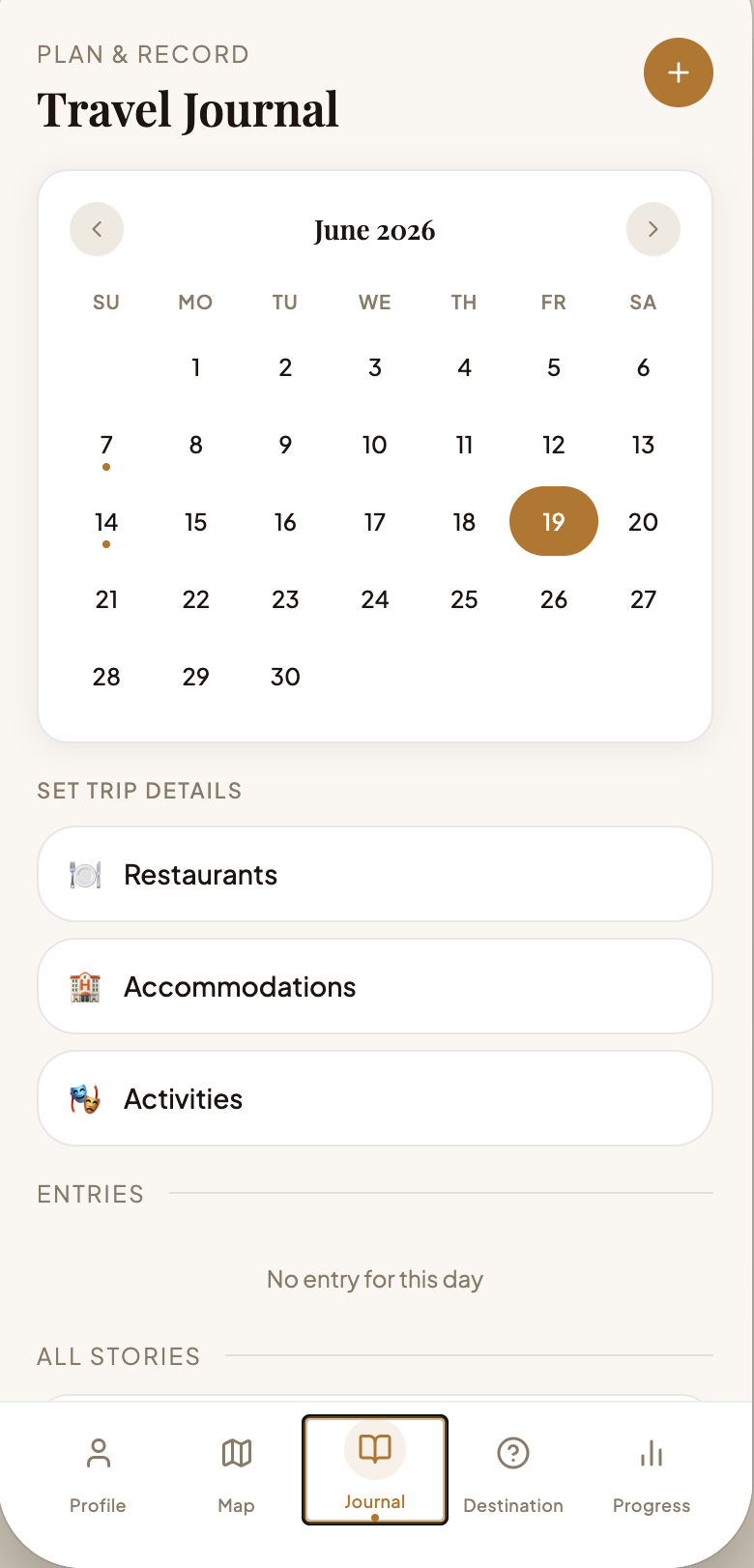
Journal — plan & record
A travel calendar plus “Set Trip Details” for restaurants, accommodations, and activities, with journal entries to remember each day. Planning the trip and remembering it live in the same place.
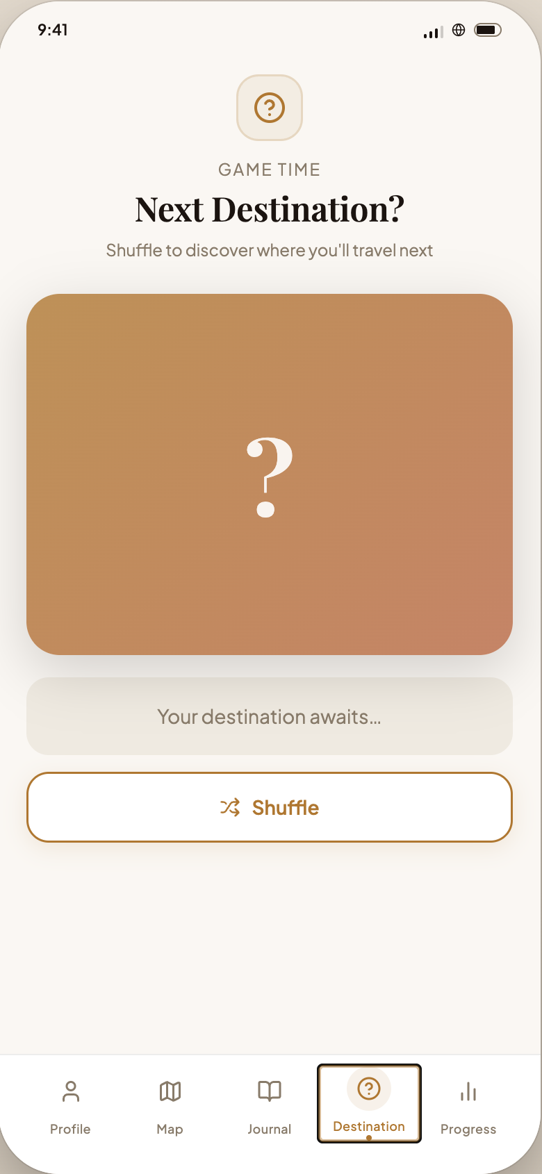
Next Destination? — a little game
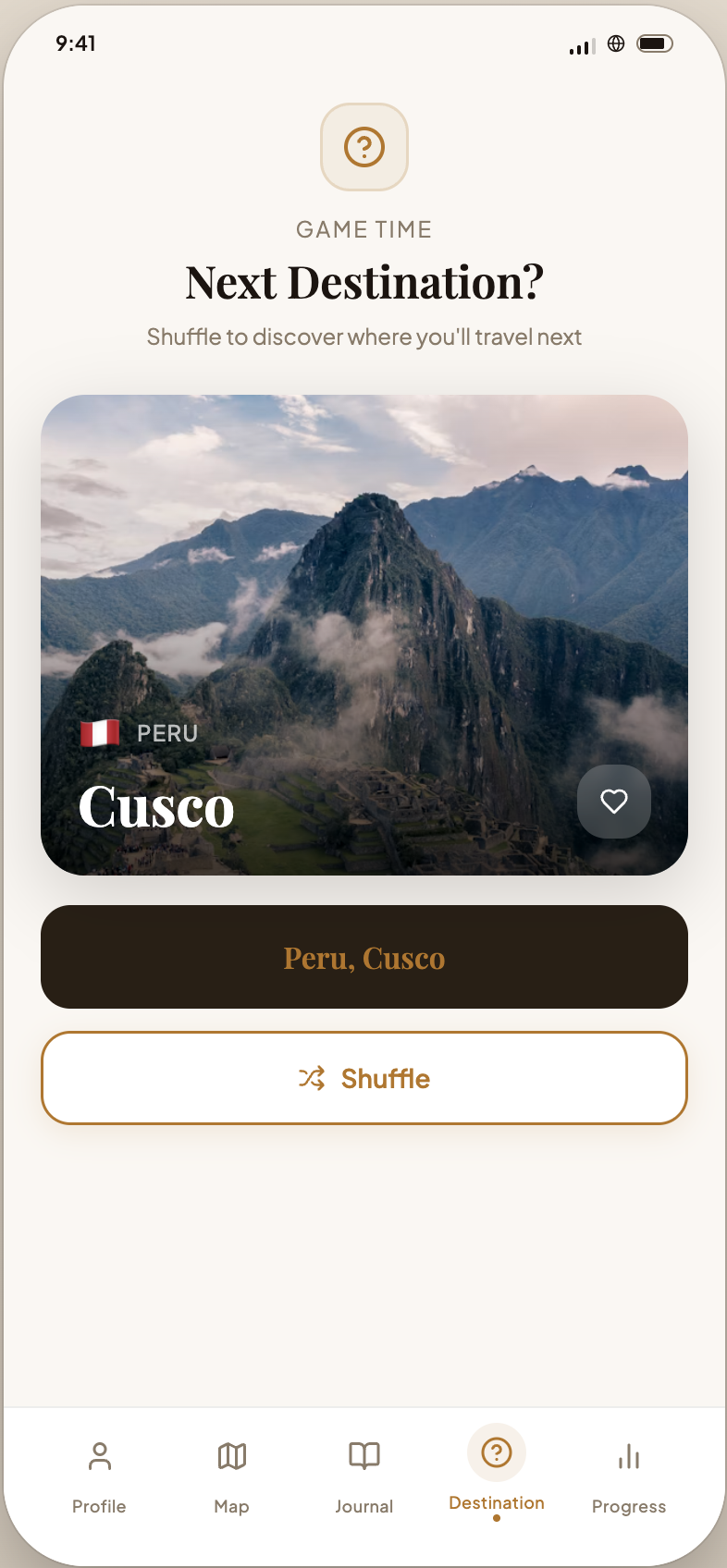
Can't decide where to go next? Tap Shuffle and Travy picks a random country and city — “Peru, Cusco” — complete with a photo to daydream over. A small, playful moment that makes the app feel human, not transactional.
Principles in practice
Three rules we held every screen to.
Aesthetic & minimalist design (Nielsen)
Every screen shows only what matters in that moment. The Journal leads with a calendar and three clear trip-detail buttons; the Profile leads with photos and progress. We cut anything irrelevant or rarely needed so the interface stays calm and scannable.
Recognition rather than recall (Nielsen)
We minimized memory load by keeping actions visible. A persistent bottom tab bar means you never have to remember where things live, and destinations appear as recognizable photo cards instead of text you have to recall.
Native to Apple's Human Interface Guidelines
We built to Apple's HIG for a true iOS feel: a standard tab bar, system behaviors adapted to a warm brand palette, clarity through a clear type hierarchy, and depth through layered cards and soft shadows.
What we learned
What the project taught me.
Designing to established heuristics — instead of just “what looks nice” — gave us a shared language to make decisions and defend them. It's the habit I've carried into every product since.
Building it in SwiftUI meant living with Apple's guidelines first-hand rather than just reading them — the fastest way I've found to internalize good iOS design.
Next project
Round-ing